cmustudent-repository
Introduction
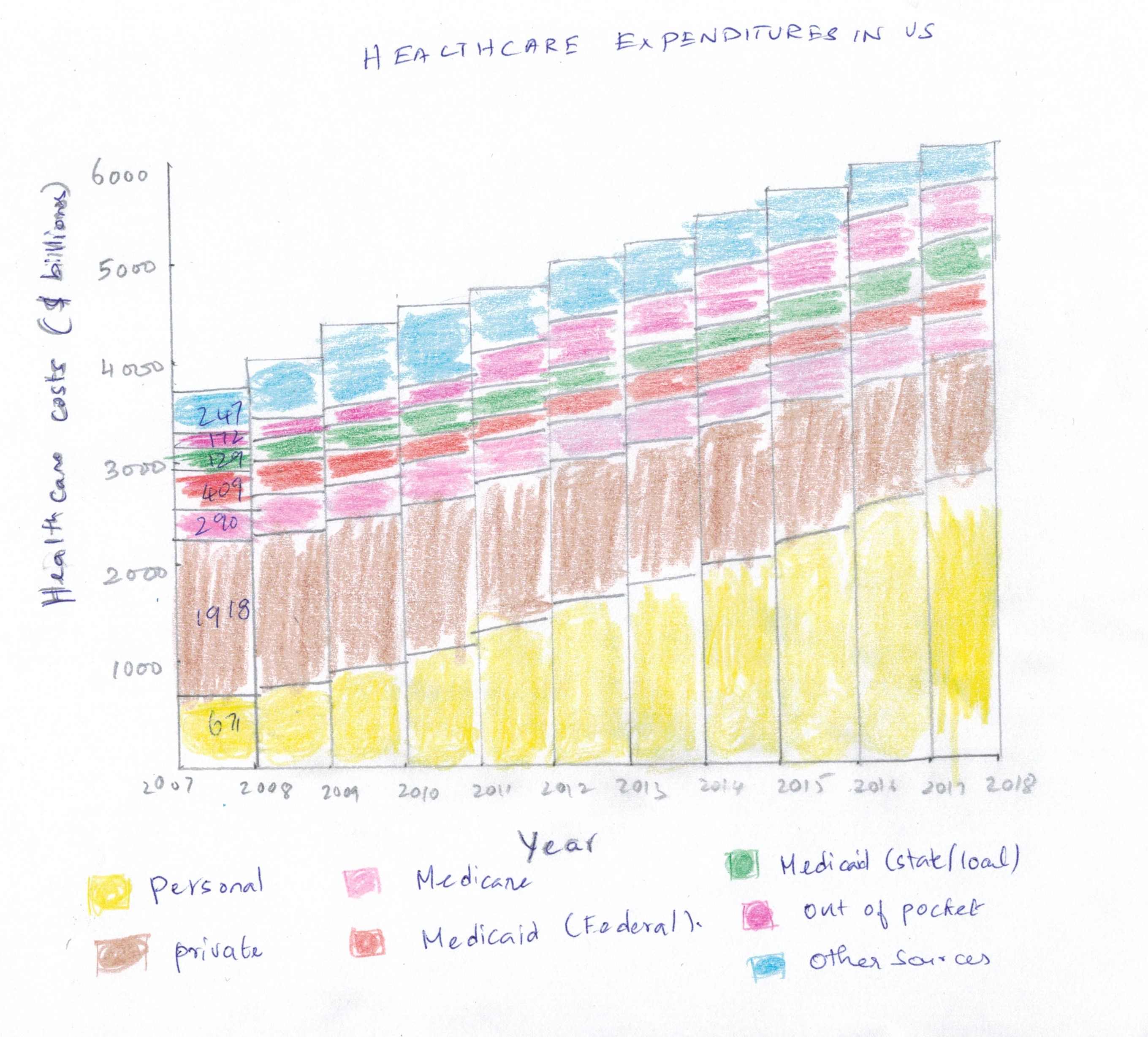
Healthcare costs in the US increase year by year significantly. Even though the Government takes active steps in minimizing the burden of the citizens thru Medicare and Medicaid, people spend more money on personal healthcare expenditures, private health insurance, and out of pocket expenses. The data for under discussion is sourced from the CDC(Center for Disease Control and Prevention) - National Center for Health statistics. Even though the original chart intended for a different reason, if the audiences are Healthcare officials and Policy Makers are to view the same data, the task is how efficiently the original data be leveraged to make the communication more effective by different visualization.

SOURCE: National Center for Health Statistics. Health, United States, 2018. Hyattsville, Maryland. 2019.
Wireframe Mockup
I did a wireframe mockup to better represent the original chart provided.Even though original chart provided relevant information, I tried to enhance based on the critique evaluation I performed.

Wireframe review and Feedback
Following questions were asked based on wireframe mockup that was created.
- Can you tell me what you think this is?
- Can you describe to me what this is telling you?
- Is there anything you find surprising or confusing?
- Who do you think is the intended audience for this?
- Is there anything you would change or do differently?
Reviewers were able to identify what was that about as the Title , legend, X and Y axis provided a fair idea on what it contains. They also did not like the colors used. Questions were around what does the color represent.Both reviewers liked the way that was represented in the mockup was bit detailed than the original graph.
Following feedback were received based on the wireframe.
- Give more details on the exact amount spend.
- Give a way to forecast the next 2 years
- Show chart comparing government funded and other sources like Personal,Private,Out of pocket etc.
- Retain the original chart for chart-2. Pie chart did not provide more information. Original Stacked bar was much better.
I did not perform any data visualization changes to chart-2 as it conveyed relevant information. Only suggestion I received was to show more data as 10 years is a huge gap.As the original data for chart-2 doesnt have for other years except 2007 and 2017, I did not try other visualization.
New Visualizations
Stacked Bar chart (Generated from flourish)
Below chart publishes Health care expenditures in USA for the period of 2007-2017 on a Stacked Bar chart
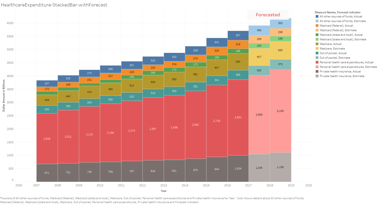
Stacked Bar chart - Forecasted (Generated from Tableau)
Below chart publishes Health care expenditures in USA for the period of 2007-2017 with forecasted information for the next 2 years
For subsequent plots I had to transpose data from rows to columns to get the desired plotting as there were missing dimensions.
Stacked Area chart (Generated from Tableau)
This is the Stacked area representation of the same data. It gives an idea how each of the costs increase in an area-wise representation

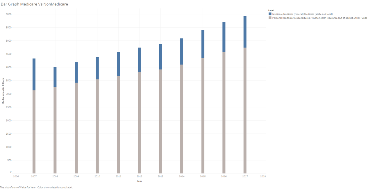
Bar Graph with Medicare/Medicaid VS Non Medicare/Medicaid(Generated from Tableau)
*This graph stricly compares Medicare/Medicaid program costs with costs incurred by the patient. This gives a straightforward view whether Medicare/Medicaid provides sufficient funds to help citizens in the increasing healthcare costs *
Multiple Pie chart (Generated from flourish)
Below chart publishes Health care expenditures in USA for the period of 2007-2017 on a Pie chart. I tried for visualization purposes
Bubble-Plot (Generated from flourish)
Below chart publishes Health care expenditures in USA for the period of 2007-2017 on a Bubble Plot. I tried for visualization purposes. Not a right fit
Stacked Column Chart (Generated from flourish)
Below chart publishes Health care expenditures in USA for the period of 2007-2017 on a Stacked Column chart. Gives an year by year view.
Conclusion
I tried different visualizations in flourish and tableau.For some of them I need to do transformations to get the plot right. Out of all charts I preferred Stacked Bar chart to be better visualization for the dataset provided. Also, Forecasting costs based on the trend will provide significant value to key stakeholders who are involved in healthcare domain.